Mobile Modals and Slideouts
Reference for mobile Modal and Slideout step types and styling.
Table of Contents
Modals and Slideouts are the step patterns you build most mobile Flows from. This reference covers the step types available and the styling options for each. To add and style the text, images, buttons, and surveys inside a step, see Mobile content blocks.
Modal and Slideout step types
Step types control how a step is displayed on the device.
Standard — a Modal with visual space on all sides.
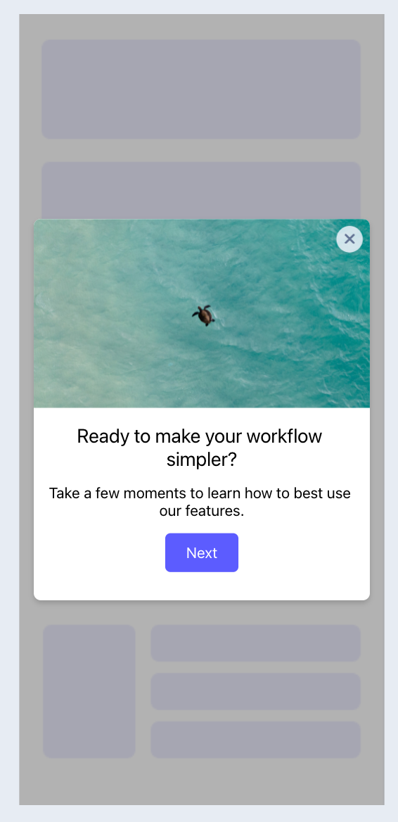
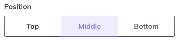
Standard Modals have a position control to align the experience to the top, center, or bottom of the screen.
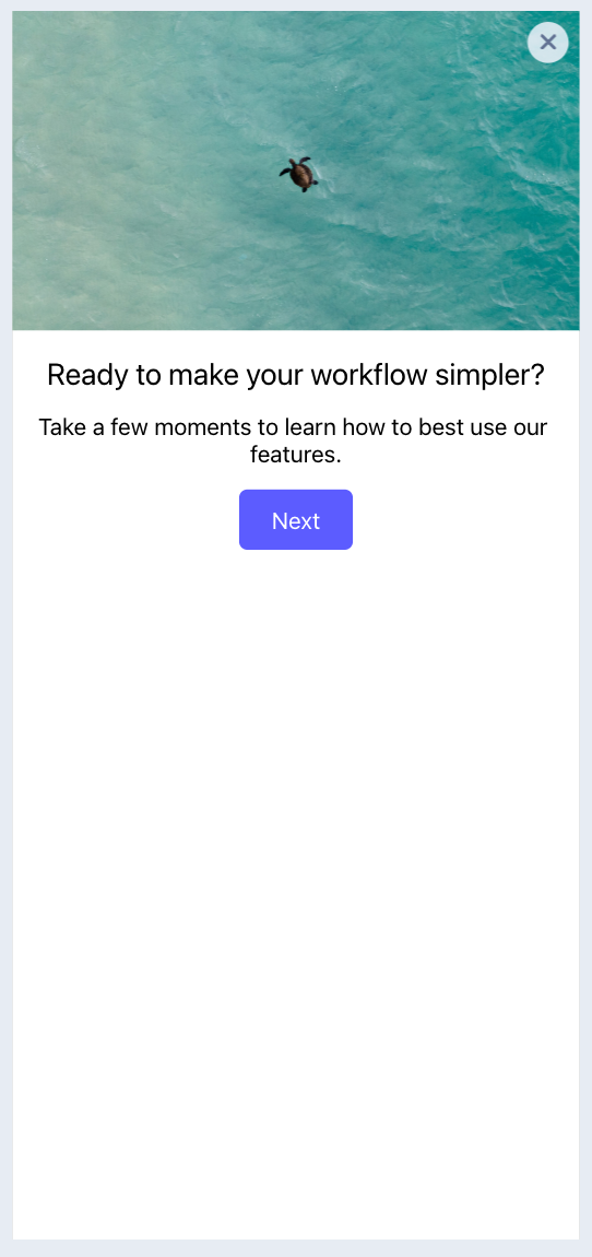
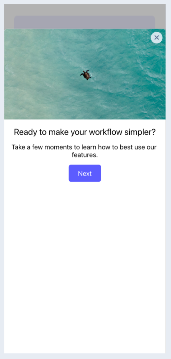
Full Screen — a Modal that covers the entire screen.
Half Screen — a Modal aligned to the bottom of the screen with visual space above it.
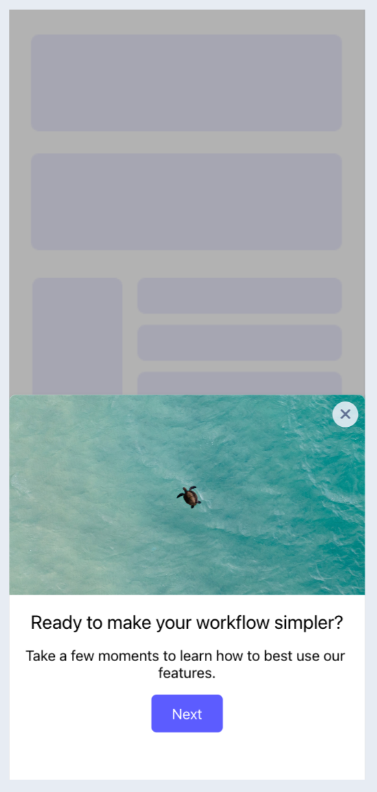
Cover Sheet — a Modal that covers most of the screen with minimal visual space at the top.
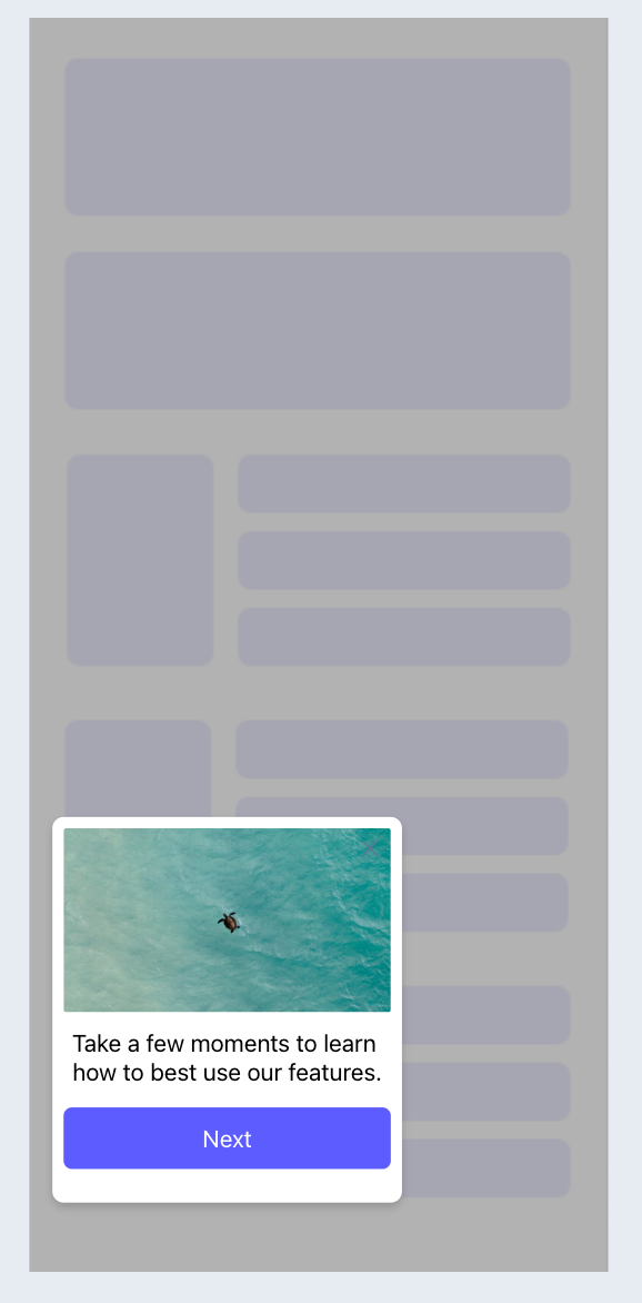
Slideout — an unobtrusive experience with visual space on all sides that can be positioned in any primary quadrant of the screen.
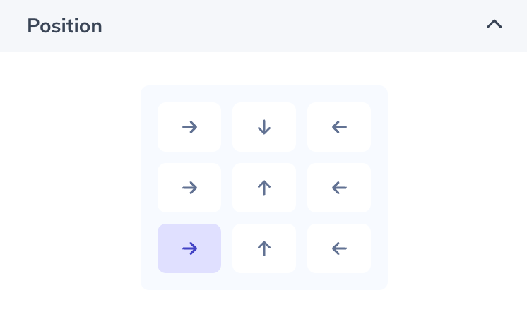
The Slideout has a position setting to specify which quadrant it displays and animates from.
Style a Modal
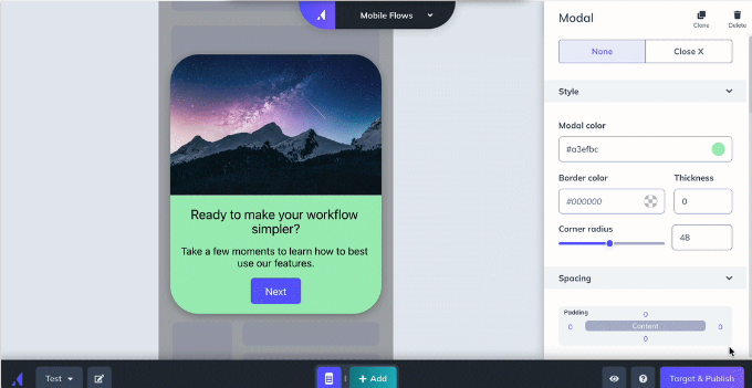
Modal styling options appear in the right sidebar. If you've clicked into a content block, click outside the Modal in the preview pane to show the Modal styling options.
- Position — Standard Modals only. Sets the Modal's vertical location.
- Modal Close — choose the "X" in the top-right corner, or none (which requires an explicit close action button in the Modal's content).
- Modal Color — pick from the color wheel or enter a hex code.
- Border Color + Thickness — Standard Modals only. Set the color and border thickness.
- Background — add a background image for the entire Modal.
- Step Indicator — show, hide, and customize the step indicators at the bottom of a Modal.
- Corner Radius — adjust the slider or enter a number.
- Spacing — enter a number on the spacing matrix to adjust padding.
- Dark Mode — select the ☾ icon in the preview display settings or color selector. Colors set in this mode apply to users viewing the experience with dark mode enabled, based on their device settings. If no dark mode color is set, the light mode color is used.
Pin a block to the top or bottom
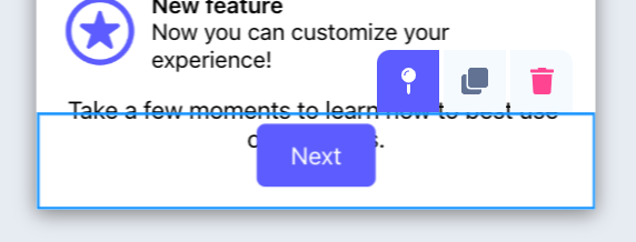
The sticky option fixes a block or row in place so it stays put while other content scrolls. To make a row sticky, select any block in the top or bottom row and click the sticky pin. Adding a block to a sticky row makes that block sticky; removing a block from a sticky row updates it to the behavior of the row it moves to.
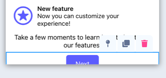
To make a row no longer sticky, select any block in it and click the sticky pin again. Moving a sticky row to a new position — or moving another row into a sticky position — also removes the sticky behavior.