Tooltips & Hotspots
Learn more about how to place tooltips and hotspots on elements in your application.
Table of Contents
Out of our 4 main flow patterns, Tooltips and Hotspots are the ones that guide users through your application! They're meant to catch the attention of your users to a particular element or area. Because of that, the Builder gives you control over where you want to attach these patterns to your application.
Tooltip progress
There are two ways to use tooltips in a Flow. A tooltip can be used with a ‘next’ button or without any buttons, resulting in a different experience:
- If a tooltip is used with a ‘next’ button, the flow will progress by clicking on ‘next’.

- If a tooltip is used without a button, the flow will progress by clicking on the element it's pointing to. These tooltips are action-driven.

Add Tooltips/Hotspots in the Builder
Once you've opened the Builder to create a flow, select the green ' + Add' button > 'Tooltip group' to choose the design of your tooltip.

The Builder gives you some templates that you can quickly select, but you're free to create your own or use a previously saved Tooltip/Hotspot template!
Place on Visible Elements
When you're ready to pin that Tooltip/Hotspot to an element, all you have to do is choose a design and click on an element in your application where you want the Tooltip/Hotspot to show up!

The area of the element will be highlighted in green so you'll know which part the pattern will be attached to.
Place on Dynamic Elements
There will be cases where you'll want to attach a pattern to an element that will only appear after some hovering or clicking action from the user, such as a dropdown menu.

If this action does not change the URL, you can anchor a Tooltip/Hotspot without needing a navigation step!
To do this, hold down the SHIFT button on your keyboard > interact with your page to show the element > release the SHIFT button, and > attach the tooltip normally.
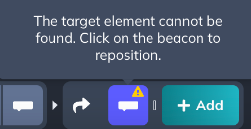
NOTE: When editing a tooltip/hotspot step where the target element isn't visible, it is expected for the step in the Builder to show a triangle caution (!) symbol, as well as a banner. Do not worry! This is normal and will disappear if the target/dynamic element is once again visible.

Additional information
At the technical level, Appcues distinguishes these elements based on the selector used for the element. Please see CSS Selectors for more information.
If an element resides in an iFrame, then you'll have to build the flow on the iFrame's source URL instead of the parent URL. Please see Using Appcues with iFrames for more information. Additionally, elements inside SVGs aren't currently supported so it wouldn't be possible to attach the patterns to those kinds of elements.