Account Profiles
Explore the data about all the users who are associated with an Account.
Table of Contents
The Account Profile page gives you a deeper understanding of the makeup of a particular Account. It brings together data about all the users who are associated with an Account (a particular Group ID) into one place, including:
- All current group properties that are available for segmenting
- All users who are associated with the Account
- Key account-level engagement insights such as pageviews/screenviews, events, active users, and more!
Each account corresponds to a specific Group ID. To explore the different accounts that are using your product, you must send Group ID’s with associated User ID’s into Appcues. Learn more about group data here.
Navigating to the Account Profile
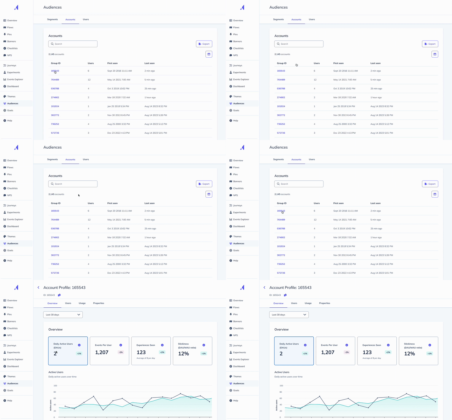
To access an Account’s profile page, use the Account List page to search for the Account you want to explore. Click the Account’s link to navigate to their full Account Profile.

Overview Tab
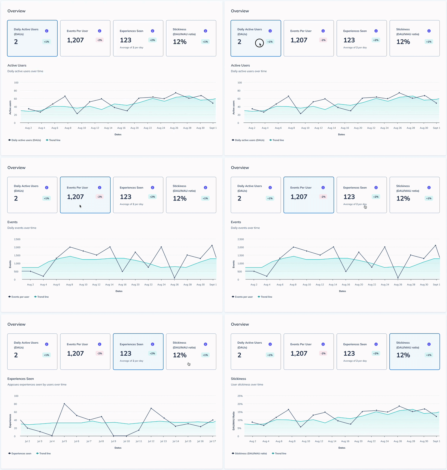
The “Overview” tab of an Account Profile provides insightful metrics that help you understand more about user behavior within an Account. You’ll see four metric cards (Daily Active Users, Events Per User, Experiences Seen, and Stickiness) that give you an indication of the activity and engagement in your product. Within each metric card, you’ll also see a change indicator, which illustrates how much this metric has changed compared to the previous time period. For example, if you’re viewing a metric over the last 30 days, the change indicator compares the previous 30 days against the 30 days prior to that.
When you select a metric card by clicking on it, you’ll see a graph indicating how this metric has changed over the selected time period. You’ll see the actual metric score for the account (the black line), as well as a trendline to show the 7-day moving average (the green line).

By default, this page shows the last 7 days of data. Use the dropdown at the top of the page if you want to change the date range to look at this Account’s data over the last 7 days, 30 days, 60 days, or 90 days. When you choose a date range, it will filter all metrics to reflect that time frame.
Note: the current date is always included in the date range. For example, if it's the 10th of the month, and you're filtering by the last 7 days, the date range consists of the 4th through the current date/time, including any data collected thus far on the 10th.

Daily Active Users (DAU)
Daily Active Users, or “DAU,” is an indication of the average number of unique users who have interacted with your product. Here, we’re displaying the average DAU count over the specified time period. For example, if you’ve selected “Last 30 days” as your date range, we are calculating DAU as the count of unique users who have logged a pageview event (web) or session event (mobile) over the past 30 days, divided by 30 to get the average. We take the average in order to smooth out day-of-week swings.
When the DAU metric is selected, you’ll see a graph that shows the count of daily active users over the selected time period. Monitoring changes in DAU over time can help you understand trends in user engagement, as well as reflect on what factors may be driving these changes.
Events Per User
Events Per User refers to the average number of events performed by each user in this account. Included in the definition of an “event” are click-to-track events and track() events. Application events from the Appcues SDK (such as mobile screenviews, web pageviews, or Appcues experience events) are excluded from the event count. This metric provides a more granular view of user engagement compared to DAU. Where DAU is useful to determine the number of users interacting with your app, Events Per User goes further by showing you how active those users are based on quantifying the activity they’re logging within your product.
Events Per User is calculated by taking the total event count (total number of events performed by users in this account over the given time frame) divided by the count of active users (unique users across web and mobile) over the given time period. This count is rounded to the nearest whole number.
Experiences Seen
Experiences Seen refers to the total number of Appcues experiences (flows, pins, banners, checklists, NPS) seen by users in this account over the given time period. This metric also shows you the average number of experiences seen across all users in this account per day.
Understanding the number of Appcues in-product messages seen by users in an account can help you measure the effectiveness of your messaging strategy, especially when comparing usage and engagement trends against your in-product messaging trends.
For example, if you are observing a spike in Stickiness and Events Per User, and you’re also seeing a spike in Experiences Seen, this could be a good indication that your messaging strategy is helping to increase product engagement. Conversely, if you are observing a drop in engagement metrics like Stickiness as the number of Experiences Seen increases, you may need to revisit your messaging strategy.
DAU/MAU Ratio (“Stickiness”)
Stickiness, sometimes referred to as the “Engagement Metric” or the “DAU/MAU Ratio,” is simply the ratio of your DAU divided by your MAU, or Monthly Active Users. The higher the DAU/MAU ratio, the more “sticky” your product is, or the more frequently users are returning to use your product. The stickiness metric helps to illustrate how well your product is capturing and retaining users’ attention.
In order to understand how we calculate the Stickiness score, first we need to understand how a given day’s DAU/MAU is calculated.
A given day’s DAU/MAU ratio is calculated by taking the average DAU value over the previous 7 days (including today’s date as one of the 7 days), divided by the MAU (unique users over the last 30 days). This ratio is illustrated as a percentage.
The Stickiness metric card displays the average DAU/MAU ratio for the given time period. For example, if “Last 30 days” is selected as the date range filter, this card shows the sum of the individual DAU/MAU ratio for each of the previous 30 days, divided by 30 to get the average.
If the Stickiness score is at 50%, this implies that, on average, a given user in this Account logs into your application 15 days in a 30-day month. A 50% Stickiness score reflects an excellent engagement rate for your product.
Users Tab
The “Users” tab of an Account Profile shows you a list of all users associated with that particular Account. This includes any users that have been active in your product, as well as any users that have been associated with the Account's Group ID via the Public API or an integration. You will also be able to see different attributes (user properties) of each user in an Account, so you can analyze and better understand the makeup of users for that Account.
By default, you will see three columns:
- User identifier (configured by you): The first column is automatically configured to match the preferred user identifier you’ve set within the User Profile. If you haven't set this up, you'll see the User ID in this column.
- If you want to change this to a different user property, follow the steps here to customize the User Profile page title, or use the column manager on this page to select a different property, and move it to the first position in the Users table.
- Clicking the value in this column will bring you directly to that user's profile
- First seen at: The very first time this user was seen in your product (where “seen” = identified by the Appcues SDK). If there is no “First seen at” value for a user, it means this user has never been identified in your product, and that this user was likely associated with the Account via the Public API or an integration.
- Last seen at: The most recent time this user was seen in your product (where “seen” = identified by the Appcues SDK). By default, this table is sorted by most recently seen users. If there is no “Last seen at” value for a user, it means this user has never been identified in your product.
You can customize your view of this table by clicking on the Manage Columns icon. You can select up to 10 total columns to display, with each column represented by a user property. This will enable you to explore different attributes of the users within an Account. (Note: the “Last seen at” column will always be present in the table, so you won't see it appear in the column manager.)
Once you’ve selected which columns you want to display, use the search bar to find the user(s) you are looking for.
Note
When a new user is associated with a given account, this list can take up to 20 minutes to reflect the new user. For this reason, you may see a user count that is greater than the actual number of users in the list for up to 20 minutes.
Usage Tab
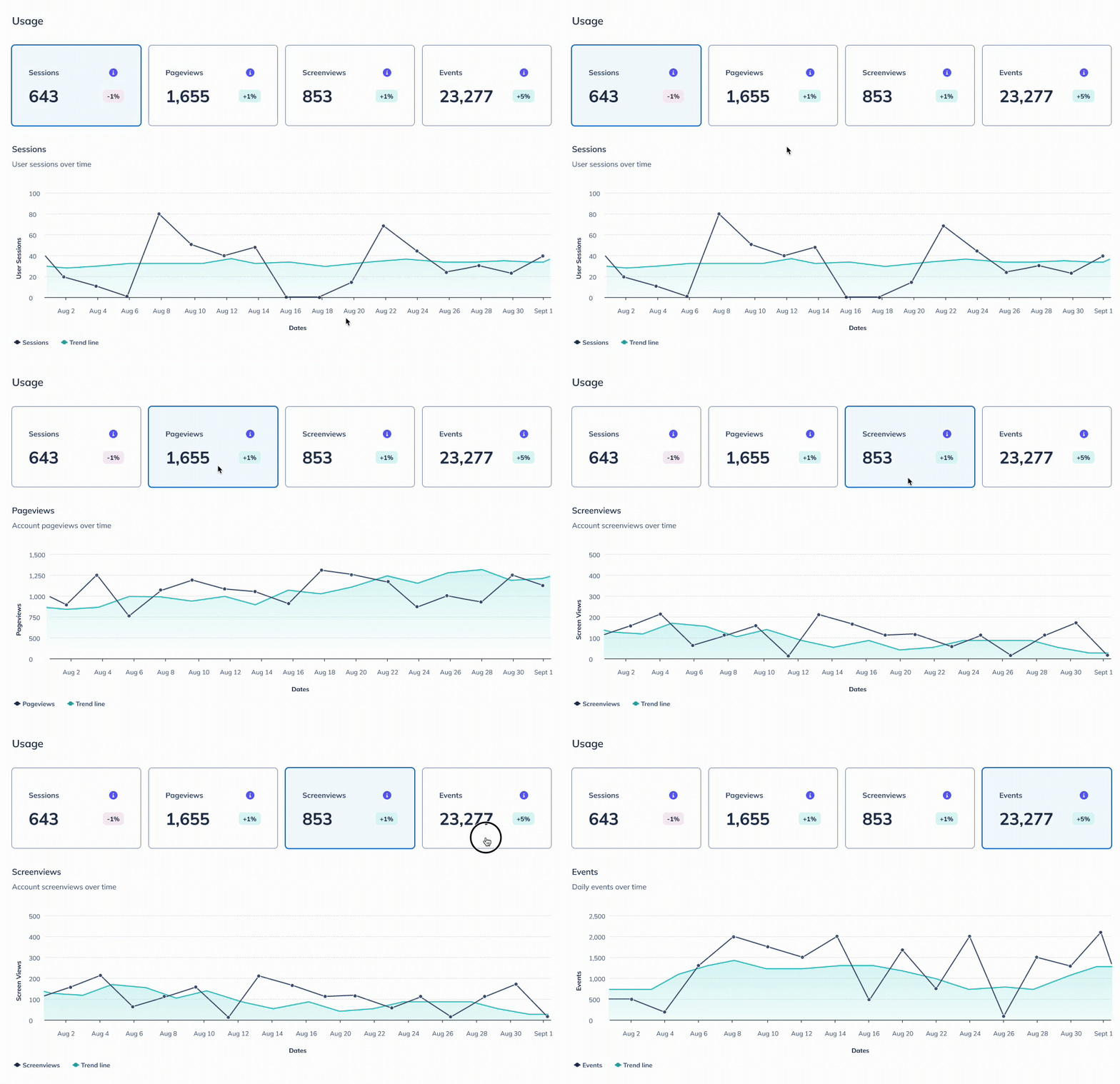
The “Usage” tab of an Account Profile helps you better understand how users from an Account are using your product. You’ll see three to four metric cards: Sessions, Web Pageviews and/or Mobile Screenviews (depending on whether you have a web app, mobile app, or both), and Events. These metrics give you an indication of the product usage for the users in this Account. Within each metric card, you’ll also see a change indicator, which illustrates how much this metric has changed compared to the previous time period. For example, if you’re viewing a metric over the last 30 days, the change indicator compares the previous 30 days against the 30 days prior to that.
When you select a metric card by clicking on it, you’ll see a graph indicating how this metric has changed over the selected time period. You’ll see the actual metric score for the account (the black line), as well as a trendline to show the 7-day moving average (the green line).

By default, this page shows the last 7 days of data. Use the dropdown at the top of the page if you want to change the date range to look at this Account’s data over the last 7 days, 30 days, 60 days, or 90 days. When you choose a date range, it will filter all metrics to reflect that time frame.
Note: the current date is always included in the date range. For example, if it's the 10th of the month, and you're filtering by the last 7 days, the date range consists of the 4th through the current date/time, including any data collected thus far on the 10th.

Sessions
A session refers to the time interval where an end-user spends uninterrupted time interacting with your product. A session begins when a user visits your app, and it ends after 30 minutes of inactivity. This number represents the total number of web and mobile sessions over the specified timeframe.
For example, if “Last 30 days” is selected as the date range, this value will be the sum of any web session and mobile session counts across the previous 30 days.
Tracking the number of Sessions across a given time period can help you more effectively measure user engagement. Higher session numbers generally indicate more engaged users.
Pageviews
Pageviews refer to the number of times a user within this account has navigated to a new web page in your web application over the specified time period. Pageviews are another useful metric for measuring user engagement, so you can see how actively users are exploring your web app.
If you are a mobile-only customer, you won’t see data related to Pageviews.
Screenviews
Whereas Pageviews refer to visits to a page in your web application, Screenviews refer to visits to a screen in your mobile app. Here, we’re displaying the number of times a user within this account has navigated to a new screen in your mobile application over the specified time period.
Similar to Pageviews, Screenviews can help you measure user engagement, so you can see how actively users are exploring your mobile app.
If you do not have a mobile app, or if Appcues is not installed on your mobile app, you won’t see data related to Screenviews.
Events
The “Events” metric displays the total number of events performed in your application (web, mobile, or both) over the specified time period. Included in the definition of an “event” are click-to-track events and track() events. Application events from the Appcues SDK (such as mobile screenviews, web pageviews, or Appcues experience events) are excluded from the event count. Monitoring the total event count over a given time period can help you measure how engaged your users are. In general, higher event counts indicate more engaged users. Conversely, a decline in event numbers might indicate a drop in user engagement.
Properties Tab
In the “Properties” tab you can review all the group properties associated with this account, either sent by you through your integration or detected automatically by Appcues. You can see the group property name, its corresponding value for this Account, and when this property was last seen (where “last seen” means the last tie this property was included in your .group() call). Use the search bar to find a specific property or value.
By default, the table will be sorted in order of which properties have been seen in the .group() call most recently.