Make Flows Skippable or Required
Learn how to ensure certain experiences are required and others skippable.
Table of Contents
Delivering the right in-product messages to the exact audiences in your application is what Appcues is all about. In doing so, you may want to make certain experiences required and others skippable. This document will explain the configuration options to do just that using Appcues Modal and Slideout pattern types.
Modal Settings
Skippable
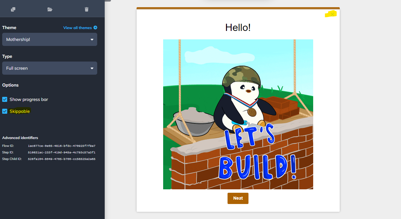
Modal patterns support a skippable toggle directly in the Appcues builder. This allows you to add a skippable X in the top right corner of your modal content container. When a user clicks on the X we will note the user's journey choices with a step_skipped and a flow_skipped event.

Modal Type
Your modal patterns will support three different types from the Type dropdown.
Standard
Displays the content in the middle of the screen with your app masked behind it.
Sidebar
Slides the content out from the side of the screen with your app masked in the background.
Full screen
Displays the content in the middle of the screen with a full coverage background so the app is not visible.
Required Modal Configuration
For required modal content you will want to make sure your modal is not skippable. When a modal is not skippable a user will need to interact with the modal content in order to progress back to your application. The modal type you choose does not matter when making the content required, however, if desired you can fully block your application from being visible with the full screen modal type.
Skippable Modal Configuration
To make your modal content skippable you can simply select the skippable checkbox on the modal step. This will add the skippable x and additionally, if you are using Standard or Sidebar modal types when a user clicks outside of the content block the modal will be skipped.
Slideouts Settings
Skippable
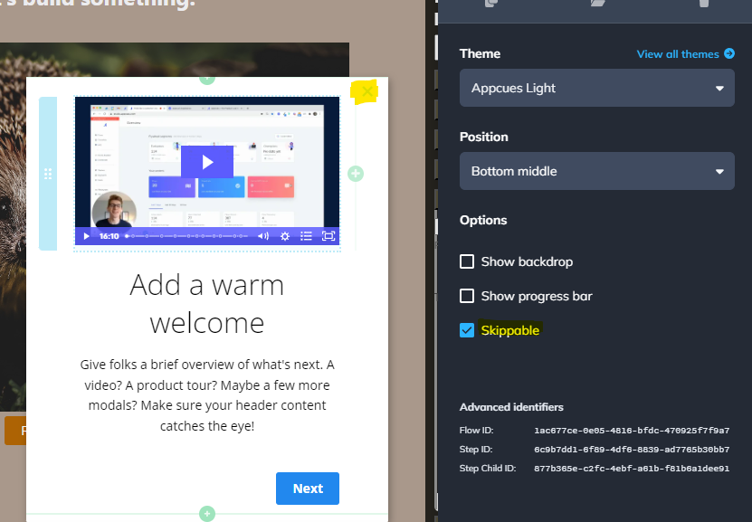
Like the modal pattern type, Slideouts also have a skippable toggle directly in the builder. This allows you to add a skippable X in the top right corner of your Slideout content container. When a user clicks on the X we will note the user's journey choices with a step_skipped and a flow_skipped event.

Backdrop
The backdrop option will include a full backdrop between the slideout content and your application. The presence of a backdrop will block users from interacting with your application elements. The backdrop color and opacity can be configured directly on your flow's theme.
Required Slideout Configuration
To make a Slideout required you will want to make sure that the skippable option is disabled for the Slideout step. Additionally, you will want to enable the backdrop option. This will make sure that the user must interact with your Slideout content before proceeding.
Configuring a Slideout to be not skippable and having no backdrop will allow a user to interact with your application and potentially navigate away from seeing the content.
Skippable Slideoute Configuration
For skippable content, you can enable the skippable flag on your slideout step to ensure your users are be able to navigate away from the experience without completing it.
Dismiss Flows with a Button
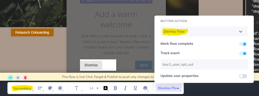
Every Appcues flow can have a button added to it that will allow a user to dismiss the flow content. By including a dismiss button you will of course be making content optional. When adding the button make sure you configure the button action to Dismiss Flow.

A couple of other tips:
- It is a common pattern type for the dismiss action to be on the left side of a content block.
- Dismiss actions should also be a different color than your primary or action. We have a secondary color scheme that you can use! You can modify your button color states by configuring your theme in Appcues Studio.
- Track additional events when your users click buttons so that you can target future experiences for folks who decide to opt-out of important messaging.