Pins
Learn more about pins, a persistent experience type that provides quick and contextual help to your users.
Table of Contents
What Are Pins?
Pins are a persistent experience type that are completely separate from Flows experiences. They are just like native helper tooltips you likely have throughout your own product already, except now you won't need any help from your tech team to make them!

Pins will not interfere with Flows at all, so Flows will still show on the page even if there are Pins already dropped on the page. Also, unlike Flows, you can set it up so that multiple Pins are targeting the same page, and as long as a user qualifies to see them, they will see all possible Pins!
Accessing Pins
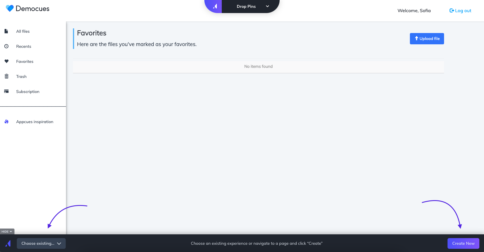
To build Pins, you'll want to go to the URL where you want to drop a Pin, and then select the Appcues Chrome Extension.
Once you select the extension, you'll be prompted to select the experience you want to build.
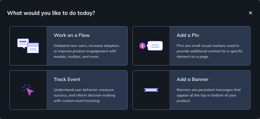
Select 'Add a Pin' to start building your first Pin.
Once you select Add a Pin, you can either select from an existing list of Pin experiences or create a brand new Pin experience.
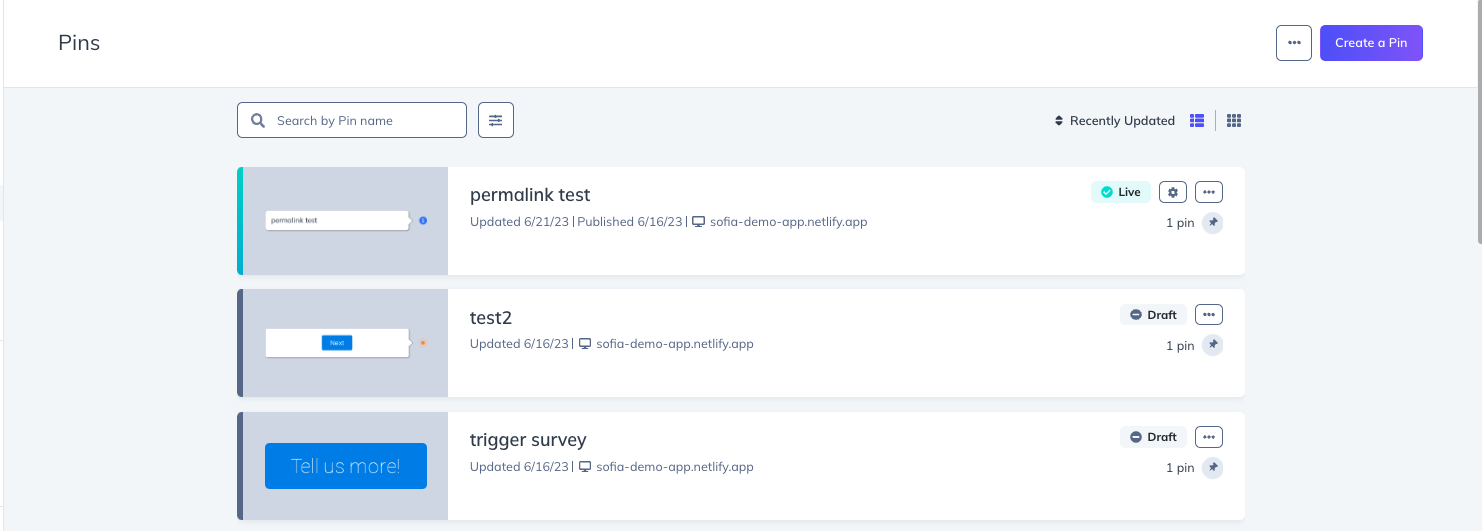
You can also access Pins from Studio. Inside Studio, select Pins from the main navigation. Here you will see a list of all your current Pin experiences, as well as the ability to create a new Pin.
Creating a Pin Experience
Once you select 'Add a Pin' from the Pin Builder, you'll be prompted to enter a name for the experience, as well as the Build URL (already prefilled with the Current URL if you started this process from the Builder), and a Theme.
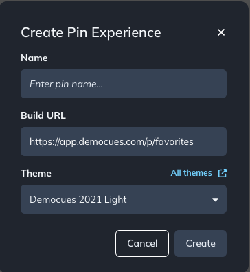
Once you select Create, click on '+ Add' and choose Icon w/ Tooltip or Button.
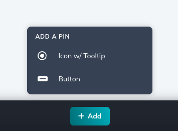
Icon w/ Tooltip
If you select Icon w/ Tooltip, you'll be able to choose an Icon for your Pin or upload your own SVG icon. Icon w/ Tooltip Pins open a tooltip when a user interacts with the icon.
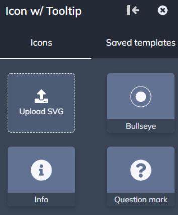
Placing the Pin
After you make a selection, you'll enter Targeting Mode and now be able to drop the Pin anywhere on the page. Pins work by being anchored to an element on the page.

To place a pin within a dropdown menu, hold shift while in Targeting Mode and place your pin. More details on this in our article on placing Tooltips.
Adding Content
Once you drop the Icon w/ Tooltip Pin, you can start adding content. Select anywhere in the green outline to add Content Blocks to your tooltip.
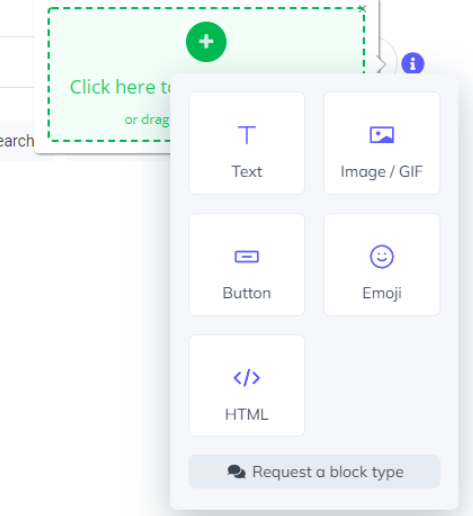
Content Blocks are what you put into each step and are how you make the content yours. Add an image, text, buttons, emojis, or even custom HTML to your Pins. Just choose the option from the menu to get started. (For more info on Content Blocks, click here)
Customizing the Icon
To customize the Icon, click the Icon and a minibar of options will appear. You can choose a different icon for your Pin, change the color of the icon, adjust the size of the Pin, or reposition the Pin.

Behavior & Position
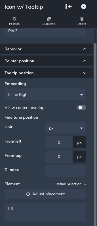
You can customize the behavior and position of the Icon w/ Tooltip. These options are available in the sidebar menu.
Behavior: Allows you to choose how the pin will open.
- On hover: The pin will open when a user hovers over the icon
- On click: The pin will open when a user clicks the icon. You can also set a close option, with an X or a Dismiss Link. In either case, clicking outside the Pin will also close it
- In either case, the pin will close when you click anywhere outside the tooltip. On hover, the pin will also close if you hover your cursor a far enough distance away from the tooltip
Pointer position: Allows you to set whether the pointer of the tooltip automatically adjusts based on screen size, or if you want to set a fixed position manually.
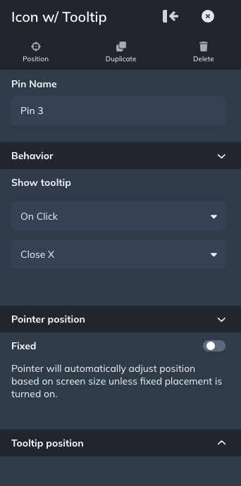
Tooltip position: This allows you to set the position of the Pin.
- Embedding: Controls how the Pin will be placed on your site
- Inline Right: Pins will be inserted within the UI of your website, and offset the target element on the right.
- Inline Left: Pins will be inserted within the UI of your website, and offset the target element on the left.
- Overlayed: Pins will be displayed on top of the target element
- Allow content overlap: Typically inline positioning will "make space" for the icon/button and expand the selected element. Enabling this toggle will remove the space and place the icon/button on top of the selected element. Allowing content overlap is great when you want to place a pin on a button without expanding the size of the button. (Only available for inline right/left embedding)
- Depending on the element you anchor the pin to, Appcues will try to choose the best default for this toggle. If your pin is not being placed where you expected, consider toggling this on/off as needed
- The position from the left, top, and the Z-index
- The ability to reposition the icon/button
- Enter a specific selector
- Refine the selector
Button Pin
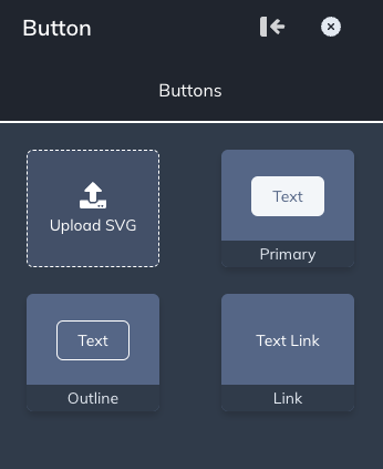
If you select Button, you'll be able to choose from your Primary button style, a hardcoded outlined button, as well as just place a button that looks like a Link, or even upload your own SVG icon. Button Pins immediately trigger flows or link off to other URLs.
Placing the Button
After you make a selection, you'll enter Targeting Mode and now be able to drop the Pin anywhere on the page. Pins work by being anchored to an element on the page.

Customizing the Button
Button Pins allow you to customize the button by using the standard button minibar for customization, as well as adjusting the text of the button.

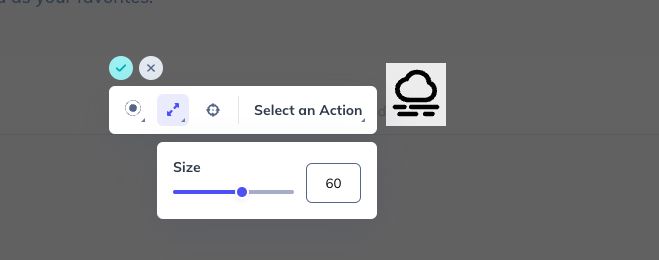
Button Pins that use an uploaded SVG icon will have a more limited minibar for customization. If needed, you can increase the size of the SVG icon above the 100 display limit. For that, type the value directly.
Button Actions

Behavior & Position
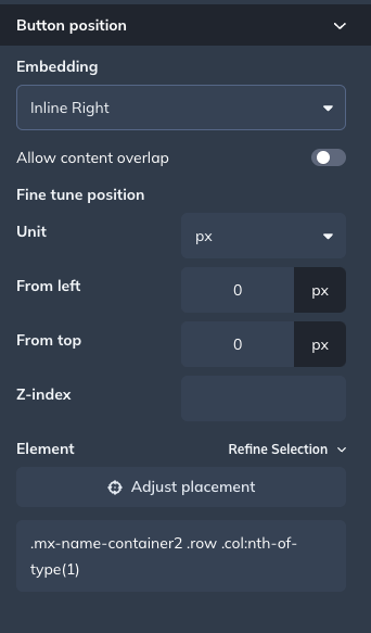
You can customize the behavior and position of the Button Pin. These options are available in the sidebar menu.
Button position: This allows you to set the position of the Pin.
- Embedding: Controls how the Pin will be placed on your site
- Inline Right: Pins will be inserted within the UI of your website, and offset the target element on the right.
- Inline Left: Pins will be inserted within the UI of your website, and offset the target element on the left.
- Overlayed: Pins will be displayed on top of the target element
- Allow content overlap: Typically inline positioning will "make space" for the icon/button and expand the selected element. Enabling this toggle will remove the space and place the icon/button on top of the selected element. Allowing content overlap is great when you want to place a pin on a button without expanding the size of the button. (Only available for inline right/left embedding)
- Depending on the element you anchor the pin to, Appcues will try to choose the best default for this toggle. If your pin is not being placed where you expected, consider toggling this on/off as needed
- The position from the left, top, and the Z-index
- The ability to reposition the icon/button
- Enter a specific selector
- Refine the selector
Pin Analytics
After you've built out your Pin experiences, you can manage them and check out their analytics. Both of these items will be done via Studio.
When clicked, you will now see a list of all the Pin experiences within your account. You can search and filter your list of Pin experiences.
You can also access the settings, and analytics page, as well as edit tags, clone Pin experiences, or Archive Pin experiences all via the more menu of any Pin.
When adjusting the settings of a Pin, you will be able to control:
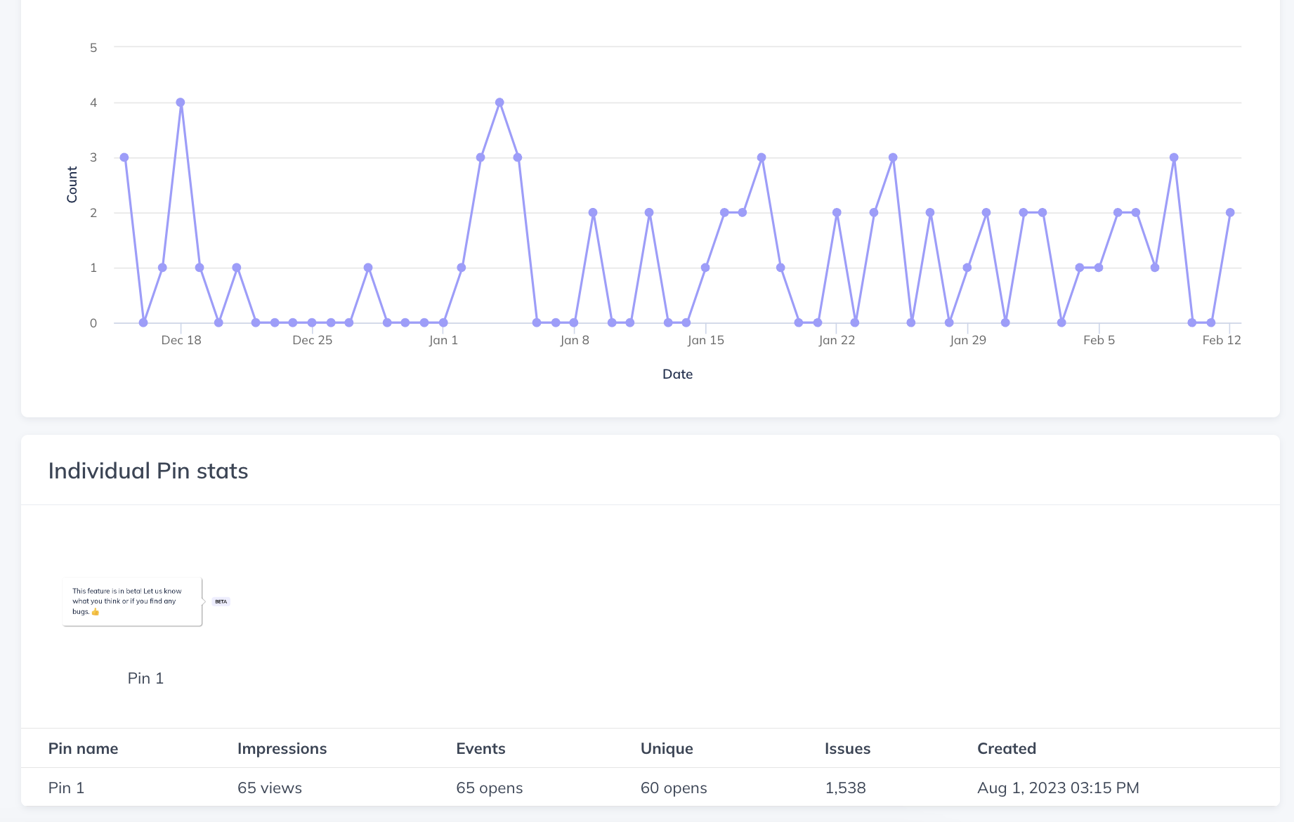
When viewing the Pin experience's analytics page, you will be able to see the total number of Opens on Icons w/ Tooltip and Clicks on Buttons per Pin, the number of unique users that have opened/clicked the Pin, as well as the total issue count per Pin (keep in mind, since Pins are persistent, the issue count is something that can only increase). Under the impressions column, you can see the number of individual times a pin was seen. A Pin experience's analytics page will also show you ALL the users that interacted with the Pins within the selected date range under the Recent Users section!
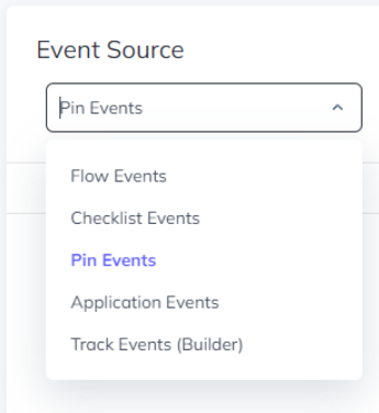
You can also view additional Pin analytics in the Appcues Event Explorer. Select Pin Events from the Source dropdown menu, and then select the Pin Experience you are interested in. From here you can select the individual Pins and see the total number of Opens on Icons w/ Tooltip and Clicks on Buttons, as well as the number of unique users that have opened/clicked the Pin.
Pin events will also be sent to our client-side integrations if you have any of those integrations enabled. The Pin events will that we send are 'experience_started', 'icon_seen', and 'step_seen'.
FAQs
Q: I see the Pins in the navigation list, but it's grayed out, why?
- A: Pins are only available on modern subscription tiers. Contact sales@appcues.com to upgrade your plan
Q: Can multiple Pin experiences be targeted on the same page? Will they all show up at the same time if a user qualifies to see them?
- A: Yes and Yes!
Q: Can Pins be dismissed?
- A: No, as long as the user qualifies they will always be on the page (just like a standard native tooltip)
Q: What is the difference between Inline Embedding and Overlayed Embedding?
- A: Inline pins are inserted into a site's HTML before or after the target element that is selected. Because the pin element now exists within the structure of the site, its positioning is affected by the elements around it. It is positioned according to the layout specified by site. There are positives and negatives to this approach. One benefit is that the pins will scroll perfectly smoothly with the page, because they are part of the page. Another benefit is that an inline pin can "make space" for itself when it is placed in between two elements on the page. A downside to this approach is that there is less control over the position of the pin. Because the pin element is part of the site's layout, its exact position is determined by the site.
Overlayed pins are not inserted directly into the structure of the site, but rather are positioned above the site. Appcues calculates the correct position periodically to ensure the correct position is maintained as the user scrolls the page or hides or expands different elements on the page. One benefit to this approach is that the position of the pin can be very specifically set. A downside, however, is that the pin is not embedded into the site so it does not scroll as smoothly with the site.
Q: I've adjusted the z-index of my inline Icon w/ Tooltip Pin, but the tooltip is still being cut off, why?
- A: If you are placing an Inline Pin within a target element or a parent container having the CSS property of overflow:hidden or overflow:auto, then the CSS property will set any overflow of that container to be clipped. This affects the inline pin because it’s nested within that container. To avoid this remove that CSS property from your element, OR place the Pin outside the container that uses this property, OR use the Overlaid embedding option.
Q: Do Pins count in accounts' Frequency Limits?
- A: No, Pins are completely separate from Flows, and will always be visible on the page regardless of limits.
Q: Do themes' custom CSS carry over to Pin Experiences?
- A: No, not at this time. Currently, Pins will only adopt the settings of the actual Theme, and not any additional custom CSS.