Flows
Learn more about Flows, the available pattern types and the components you can include when building.
Table of Contents
Getting Started
This guide will walk you through the basics of building web flows in Appcues, for mobile flows see Building Mobile Flows. When building a flow, it's important to think about what sort of experience you're trying to create for your users. This will help inform exactly what you want each step of your flow to look like, as well as what components you will add to those steps.
Appcues Webinar - Builder 101
If you'd like to watch a demonstration of all the steps that go into building an Appcues flow, including some handy tips and tricks, check out this webinar focused on our Flow Builder.
The pattern types that make flows
A flow is made up of steps, and each one of those steps will be one of four pattern types: Modals, Slideouts, Hotspots, and Tooltips.
Modals
Big, screen-takeover experiences. Because they have more space, they are great for giving users context at the start of the flow.
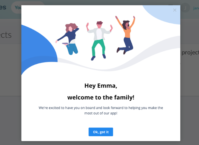
Read more about how we've used them to welcome and motivate users, announce new features, or give your users a "choose your own adventure" onboarding experience.
Slideouts
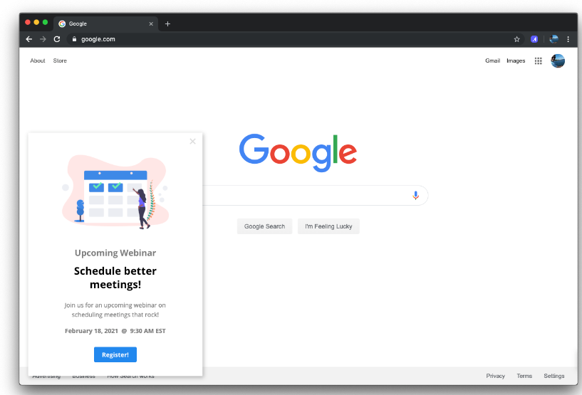
Smaller, less intrusive way to communicate your message. Great for announcing smaller releases, collecting product feedback, or driving users to specific actions.
Hotspots
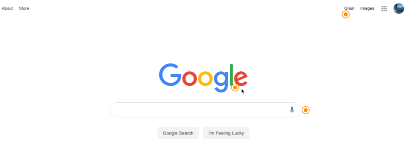
Helpful guideposts in your product. Great for "passive" feature discovery. Use hotspots to provide your users with on-demand guidance or tips, or point out smaller UI changes.
Hotspots are unique in that you can have several visible on the page at the same time, although only one at a time can be expanded.
Tooltips
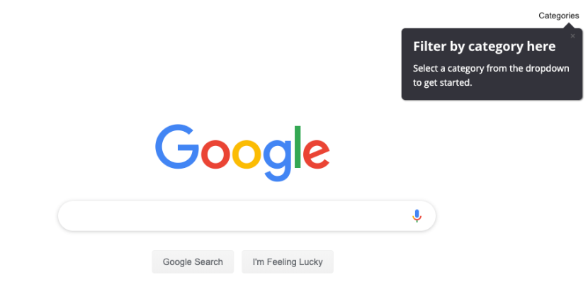
Next action pointers. Tooltips are best used to direct sequences and walkthroughs. With tooltips, you might point out a useful feature on your site or tell users where to click next.
Step settings
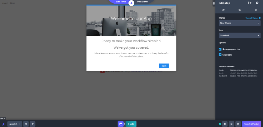
The presentation and behavior of each step in your flow can be customized using step settings. Here's a lightning-quick tour of the options in the step settings panel.
- Theme: choose which theme to apply to that step (or step group).
- Position (slideouts only): select where on the screen the slideout should display.
- Backdrop (slideouts and tooltips only): add a backdrop to the step (for making sure the user is able to focus on it).
- Progress bar (modals and slideouts only): display a horizontal bar for users to track progress through the flow.
- Skippable: allow the user to dismiss this step (exits the entire flow).
- Beacon (hotspots and tooltips only): style the point the step is anchored on.
- Alignment (hotspots and tooltips only): customize the arrow that points to the beacon.
- Placement (hotspots and tooltips only): change where on the page the step appears. For more on anchoring steps to elements on the page, check out our doc on CSS selectors.
- Progress on click of (tooltips only): while not a visible setting in the step settings, tooltips that don't have a button with a "Next" action will automatically be set to progress when the element they're pointing to is clicked.
Adding additional steps
When creating a new step, you can choose to add it to the current step group or create an entirely new step group. Functionally, there are a few differences between these two options. For a detailed breakdown, check out our doc on Groups and Step-Groups.
Adding components to a step
Components are what you put into each step and are how you make the flow content yours. Add images, videos, text, buttons, survey options, and even custom HTML to your steps. Just choose the option from the menu to get started. After adding an element, you can re-size it as well.
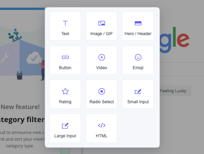
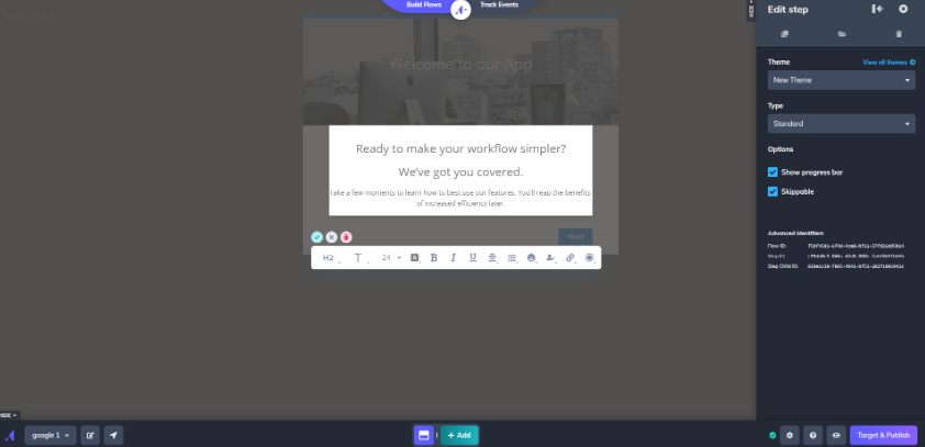
Once added to your step, components can also be styled using the options in the Appcues Builder, in Themes, or by adding custom CSS to a theme. Read more about that topic in the guide to styling flow content.
Component guides
Our goal is to make working with components in the Appcues Builder easy. But some components have advanced options, so we have specific guidelines for them below.
Working with buttons
To learn all about buttons, check out our documentation Buttons in Flows.
You can use custom buttons to:
- Move users to the next step in your flow. 👍
- Direct users to a specific path (inside your app) or URL (outside your app).
- Direct users to a custom step in the current step group (good for creating choose-your-own-adventure experiences). Learn more about branching logic.
- Trigger a different flow (also good for self-direction around an app).
- Track custom events and update user properties (which you can use for creating segments and goals, and targeting flows).
Working with images, videos and GIFs
You can add videos and GIFs to any pattern type - and we recommend you do! They are a great way to explain workflows visually.
To learn more about embedding videos in Flows, check out our documentation Embed a Video in a Flow.
To add a video: add a new 'video' component, and then paste in the embed code from a web video service. We explicitly support Wistia, Vimeo, and YouTube embeds, other services are supported using the HTML using 'iframes'.
To add an image/GIF: add an 'image/gif' component, and then upload the GIF. You can re-size or move it around the step from there.

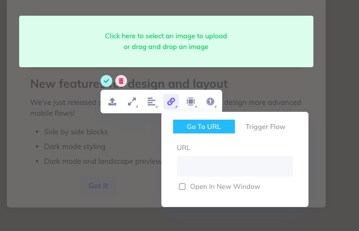
On an image/GIF, you're able to add additional settings such as Go To a URL or Trigger a Flow. When that image is clicked, the action selected will occur.
Working with Surveys & Forms
Surveys & Forms allow your users to provide feedback in various ways.
For more information on these components check out our Creating Forms & Surveys guide.
Working with Custom HTML
When our component options aren't enough to achieve your design, or when you want to add content from other platforms to your steps, use the Custom HTML option.
You can add markup to a Custom HTML component, but we only support embeds from Calendly, Fleeq, Pulsemotiv, Typeform, and HubSpot. If you'd like to see another provider supported, please reach out.
Please note: For security reasons, we do not support JavaScript in Custom HTML blocks (outside some whitelisted partners). Most embedded content will require using an iframe embed.
The HTML editor will sanitize all input to prevent malicious content. This has an effect if you need to use JSON in HTML attribute values. You will need to use special formatting for these values so that they are rendered properly. All JSON values must have double quotes that are part of the JSON string replaced with". For example, myJsonAttribute="{"key":"value"}" must be entered into the HTML editor as myJsonAttribute="{"key":"value"}"
Building a flow across pages
To learn more about how to build a flow across pages, check out our documentation: Build a Flow Across Pages.

Building on Dynamic Elements
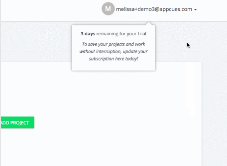
To place hotspots and tooltips on dynamic elements:
- Click to reposition your tooltip/hotspot or click on 'Place tooltip on element' from the builder side menu.
- When you have the tooltip/hotspot, hold shift to interact with the page.
- Place the tooltip or hotspot on the now-exposed element.
Things to keep in mind:
- Hotspots work independently from each other and will appear at once as a group: if any hotspots in your flow are on dynamic elements, all other hotspots will appear first and continue to persist (unless clicked) until the dynamic element is exposed.
- Tooltips are sequential and will always launch in order: if your first tooltip is hidden on a dynamic element, the entire flow will not appear until that element is visible to your end-user
- In the editor, when your element is not exposed you will see an error message that states "Element not found" -- you can still edit your text/HTML and when your element is again exposed, the tooltip or hotspot will re-position itself onto it. Preview your flow to verify that your tooltip or hotspot is attached to the right element (click the eye icon in the bottom right of your editor to preview the current flow or group)
- While most hotspots and tooltips can attach to most dynamic elements, we don't currently support elements that appear and disappear upon hover
Placing multiple hotspots on a dropdown is not a great experience for your customers, especially because the dropdown might be closed and they will not be able to advance to the next step in the flow. Consider having a singular hotspot, at least, to let them know to open the dropdown first.
Tying it all together
While building, you can preview how a specific step or entire flow will behave by using the Preview option. Preview is great for making sure all the steps in the flow work together just how you intended.
You can find Preview in the builder bar (look for the 👁️ icon). Head to the guide on testing flows for more.